From showcasing the available room types to sumptuous dining options, a well-designed and structured website serves as a virtual doorway to the experiences awaiting your guests. This article delves into best practices for crafting a successful hotel website – a channel that tells your brand story, informs potential guests about what to expect, and converts lookers into bookers.
The Website Header & Navigation
Let’s first look at the website header, the top part of the website, which usually contains the website navigation. A few best practices are listed below, followed by specific examples.
Best Practices & Examples
- Navigation: It was a common practice to place all main navigation items in the website’s header for quick access. Nowadays, many websites use a navigation overlay which can be accessed via a ‘hamburger’ menu icon. The latter option gives the website a ‘clean’ and more modern look and feel.
- Visual impact: The header usually contains a hero image or video for a visual first impression. You could opt for maximum visual impact by presenting the hero visual full screen. For a more brand-centric design, a choice can be made to place less emphasis on the image and more on the logo, brand colors, and other brand elements.
- Important Call To Actions (CTA). Important CTAs to include at the top of a hotel website are a ‘book’ button and/or booking widget, a language switcher, and, for hotel groups, a location dropdown. In addition, you could add a “Contact” CTA allowing users to get in touch with you effortlessly.
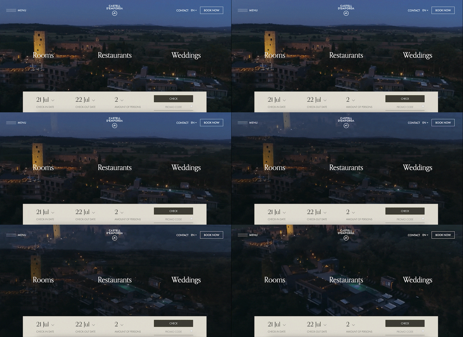
HotelCastellEmporda.com
Hotel Castel Emporade used a visual as a header, where a drone video plays full screen for maximum visual impact. Three main navigation items are presented on top of the hero video,
and other navigation items can be accessed via the hamburger menu.
Janluykenamsterdam.com
Jan Luyken Amsterdam opts for a brand-centric design whereall the main navigation items are listed in the header. This allows users to navigate the website quickly.
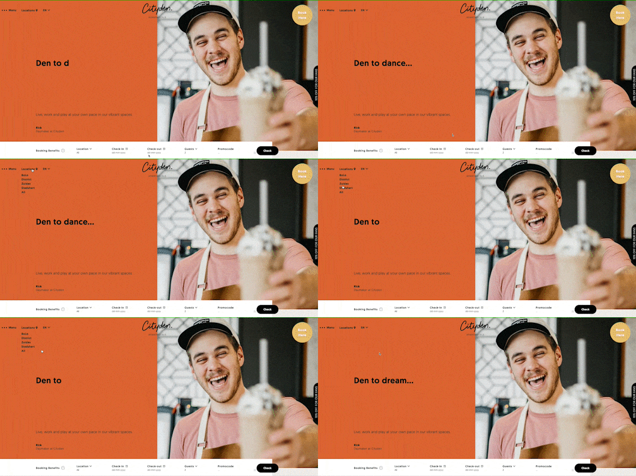
Cityden.com
Cityden uses a creative and animated header with a hamburger menu and a dropdown to select a location/property.
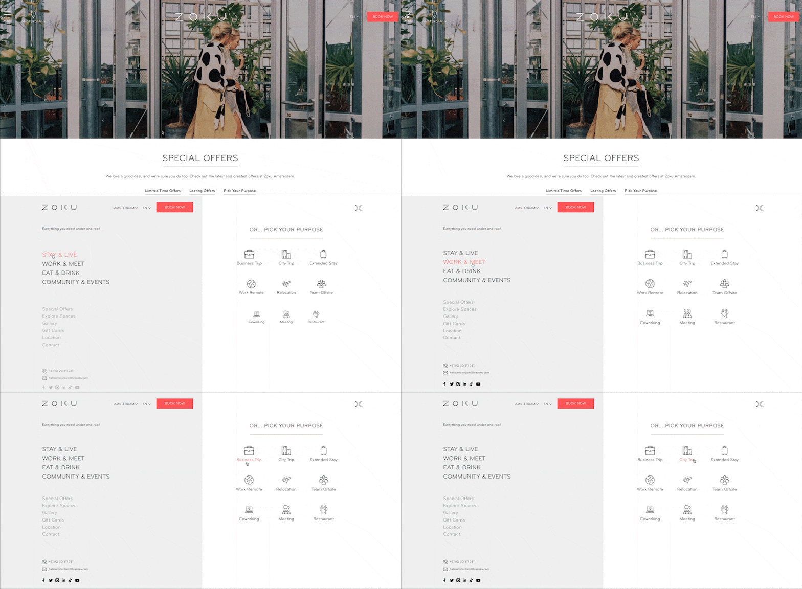
Livezoku.com
Zoku Hybrid Hotels‘ website has a navigation overlay, offering users to navigate either based on topic (e.g., stay, work) or based on purpose.
Karelv.nl
On the mobile version of the Karel V website, sticky navigation is added. It consists of 3 often-used call-to-actions and a hamburger menu icon to display all navigation items.

Content
Below you’ll find content best practices, followed by specific examples.
Best Practices & Examples
- Differentiators: Most hotels offer a variety of room types at different price points. Therefore, it’s recommended to present the unique selling points or key differentiators per room type. These should give a clear answer on why Room X has a higher price than Room Y. Is it additional space, a magnificent view, or extra facilities?
- Key information: Present the key information in an easy-to-read way. For example, when exploring dining options at a hotel, the user would most likely want to know the following information: restaurant type/theme, opening hours, and menu & pricing
- Visuals: Images on the hotel website play a critical role in users’ decisions, allowing them to create a mental picture of their stay and experience. The hotel experience can also be presented in other visuals, such as short videos, virtual tours, or an Instagram feed.
- FAQ: Add FAQ sections to answer common questions such as ‘Can I bring a pet?’, ‘Do you have baby cots available?’ and ‘What is the check-in time?’
Amstelhotel.com
On the Amstel Hotel‘s website, the room description presents the differentiators of the specific room type.

The Dylan Amsterdam
The Dylan Amsterdam website includes an embedded Instagram feed for ‘behind the scenes’ images and video, supporting the brand story of the hotel.

Enhancing the User Experience
Below you’ll find user experience best practices, followed by specific examples.
Best Practices & Examples
- User in control: Use tabs, dropdowns, and accordions to present information in a compact way. These types of elements put the user in control; it gives them the option to view less or more information on a certain topic.
- The CMS: The user experience isn’t only important for your guests and the hotel team. The website’s Content Management System (‘CMS’) should make adjusting content effortless. Practical examples are a chef changing the restaurant menu, your HR colleague adjusting vacancies, or your revenue team adjusting promotions and special offers.
- Pagespeed: A fast website enhances the user experience and can positively impact the ranking of your website in search engines. It’s recommended to avoid large resources, especially on the homepage. Specifically, third-party resources, such as Google Tag Manager, Google Maps, a live Instagram Feed, or scripts for notifications and pop-ups, can significantly impact your page speed.
Hotelheritagegrandperast.com
On the Grand Hotel Perast website, tabs and filters are used so that users can easily browse through the image gallery.

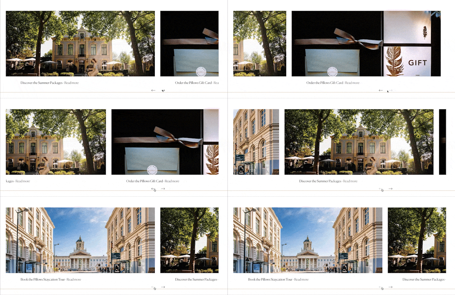
Pillowshotels.com
Pillows Hotels‘ website contains sliders that are used to present information in a horizontal format. This reduces the page length and therefore enhances the user experience.
Livezoku.com
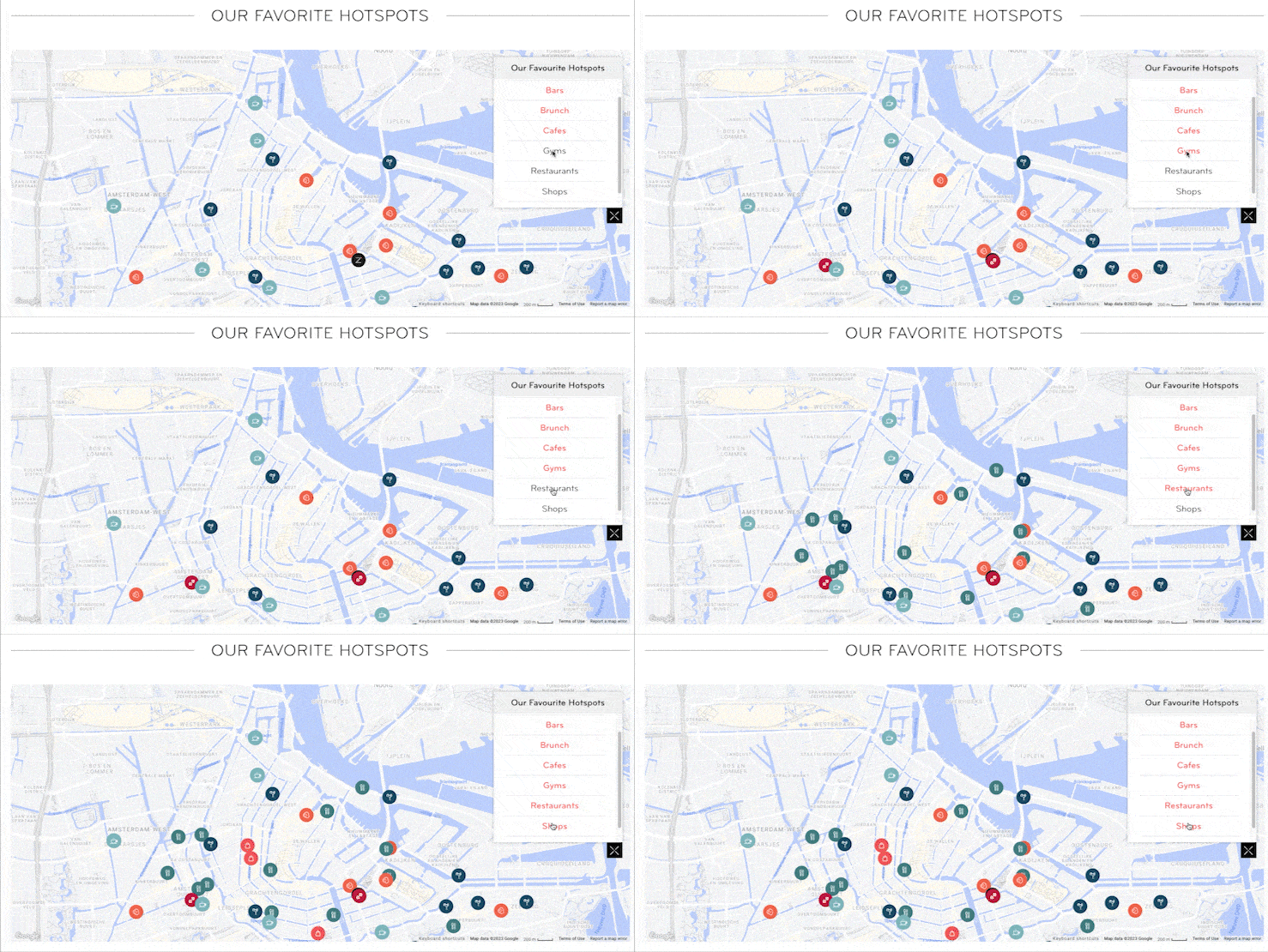
Zoku Amsterdam‘s website has an interactive map with highlights. The user can pick the desired categories for a good overview of the relative location of the hotel.
F&B Menus
Easy to use by the F&B team to update menus, pricing, and ingredients.

Pop-ups
Here’s an example of an integrated pop-up solution that does not require third-party plugins or scripts and can easily be adjusted.

A Checklist for Your Hotel Website Project
In today’s digital era, a well-crafted hotel website is a powerful marketing tool and a virtual gateway to the guest experience. Following the aforementioned best practices can enhance the guest experience online. For even more tips and tricks, you can download a free copy of the ‘Hotel Website Checklist’.
This extensive checklist can support you in creating a Website Project Brief and gives more insights on designing the right User Experience on your (new) website. On top of that, it also provides additional tips for the launch phase of the website, to ensure a successful activation.
Free Download: Hotel Recruitment Marketing eBook
It is more important than ever that recruitment efforts are robust and polished to stand out from the crowd and grab the gems among the small pool of candidates. This hotel recruitment marketing eBook will give you some pointers on improving your recruitment efforts.
Click here to download the “Hotel Recruitment Marketing eBook”.


